We’re ironically searching for counterexamples to the Riemann Hypothesis.
- Setting up Pytest
- Adding a Database
- Search Strategies
- Unbounded integers
- Deploying with Docker
- Performance Profiling
- Scaling up
- Productionizing
In the last article we added a menagerie of “production readiness” features like continuous integration tooling (automating test running and static analysis), alerting, and a simple deployment automation. Then I let it loose on AWS, got extremely busy with buying a house, forgot about this program for a few weeks (no alerts means it worked flawlessly!), and then saw my AWS bill.
So I copied the database off AWS using pg_dump (piped to gzip), terminated the instances, and inspected the results. A copy of the database is here. You may need git-lfs to clone it. If I wanted to start it back up again, I could spin them back up, and use gunzip | psql to restore the database, and it would start back up from where it left off. A nice benefit of all the software engineering work done thus far.
This article will summarize some of the data, show plots, and try out some exploratory data analysis techniques.
Summary
We stopped the search mid-way through the set of numbers with 136 prime divisors.
The largest number processed was
1255923956750926940807079376257388805204 00410625719434151527143279285143764977392 49474111379646103102793414829651500824447 17178682617437033476033026987651806835743 3694669721205424205654368862231754214894 07691711699791787732382878164959602478352 11435434547040000
Which in factored form is the product of these terms
  2^8   3^7   5^4   7^4  11^3  13^3  17^2  19^2  23^2  29^2
 31^2  37^2  41^2  43^1  47^1  53^1  59^1  61^1  67^1  71^1
 73^1  79^1  83^1  89^1  97^1 101^1 103^1 107^1 109^1 113^1
127^1 131^1 137^1 139^1 149^1 151^1 157^1 163^1 167^1 173^1
179^1 181^1 191^1 193^1 197^1 199^1 211^1 223^1 227^1 229^1
233^1 239^1 241^1 251^1 257^1 263^1 269^1 271^1 277^1 281^1
283^1 293^1 307^1 311^1 313^1 317^1 331^1 337^1 347^1 349^1
353^1 359^1 367^1 373^1 379^1 383^1 389^1 397^1 401^1 409^1
419^1 421^1 431^1 433^1 439^1 443^1 449^1 457^1 461^1 463^1
467^1 479^1 487^1 491^1 499^1 503^1 509^1 521^1 523^1 541^1
547^1 557^1 563^1 569^1 571^1 577^1
The best witness—the number with the largest witness value—was
38824169178385494306912668979787078930475 9208283469279319659854547822438432284497 11994812030251439907246255647505123032869 03750131483244222351596015366602420554736 87070007801035106854341150889235475446938 52188272225341139870856016797627204990720000
which has witness value 1.7707954880001586, which is still significantly smaller than the needed 1.782 to disprove RH.
The factored form of the best witness is
 2^11   3^7   5^4   7^3  11^3  13^2  17^2  19^2  23^2  29^2
 31^2  37^1  41^1  43^1  47^1  53^1  59^1  61^1  67^1  71^1
 73^1  79^1  83^1  89^1  97^1 101^1 103^1 107^1 109^1 113^1
127^1 131^1 137^1 139^1 149^1 151^1 157^1 163^1 167^1 173^1
179^1 181^1 191^1 193^1 197^1 199^1 211^1 223^1 227^1 229^1
233^1 239^1 241^1 251^1 257^1 263^1 269^1 271^1 277^1 281^1
283^1 293^1 307^1 311^1 313^1 317^1 331^1 337^1 347^1 349^1
353^1 359^1 367^1 373^1 379^1 383^1 389^1 397^1 401^1 409^1
419^1 421^1 431^1 433^1 439^1 443^1 449^1 457^1 461^1 463^1
467^1 479^1 487^1 491^1 499^1 503^1 509^1 521^1 523^1 541^1
547^1 557^1 563^1
The average search block took 4m15s to compute, while the max took 7m7s and the min took 36s.
The search ran for about 55 days (hiccups included), starting at 2021-03-05 05:47:53 and stopping at 2021-04-28 15:06:25. The total AWS bill—including development, and periods where the application was broken but the instances still running, and including instances I wasn’t using but forgot to turn off—was $380.25. When the application was running at its peak, the bill worked out to about $100/month, though I think I could get it much lower by deploying fewer instances, after we made the performance optimizations that reduced the need for resource-heavy instances. There is also the possibility of using something that integrates more tightly with AWS, such as serverless jobs for the cleanup, generate, and process worker jobs.
Plots
When in doubt, plot it out. I started by writing an export function to get the data into a simpler CSV, which for each $ n$ only stored $ \log(n)$ and the witness value.
I did this once for the final computation results. I’ll call this the “small” database because it only contains the largest witness value in each block. I did it again for an earlier version of the database before we introduced optimizations (I’ll call this the “large” database), which had all witness values for all superabundant numbers processed up to 80 prime factors.. The small database was only a few dozen megabytes in size, and the large database was ~40 GiB, so I had to use postgres cursors to avoid loading the large database into memory. Moreover, then generated CSV was about 8 GiB in size, and so it required a few extra steps to sort it, and get it into a format that could be plotted in a reasonable amount of time.
First, using GNU sort to sort the file by the first column, $ \log(n)$
sort -t , -n -k 1 divisor_sums.csv -o divisor_sums_sorted.csv
Then, I needed to do some simple operations on massive CSV files, including computing a cumulative max, and filtering down to a subset of rows that are sufficient for plotting. After trying to use pandas and vaex, I realized that the old awk command line tool would be great at this job. So I wrote a simple awk script to process the data, and compute data used for the cumulative max witness value plots below.
Then finally we can use vaex to create two plots. The first is a heatmap of witness value counts. The second is a plot of the cumulative max witness value. For the large database:
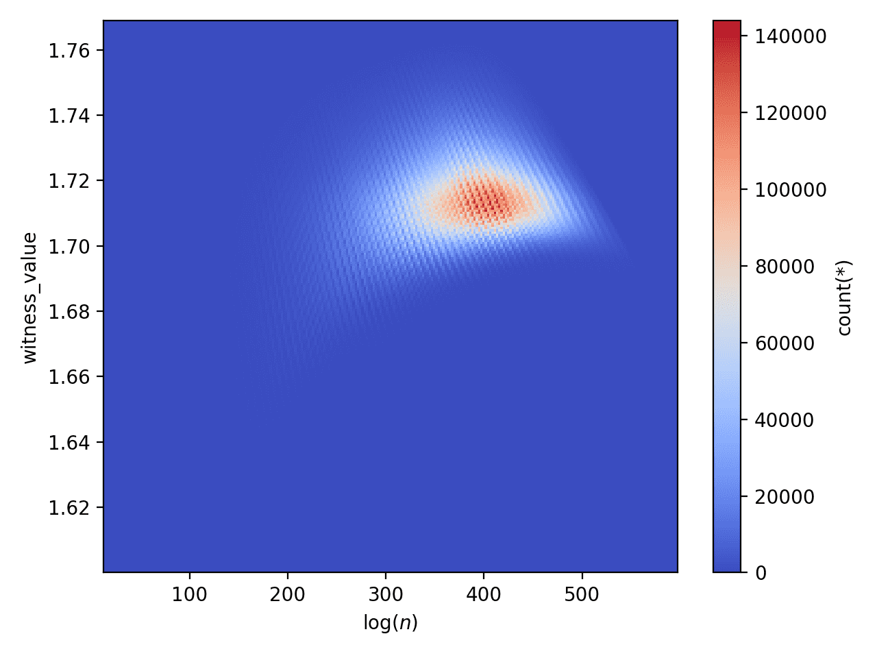
Witness value heatmap for the large database
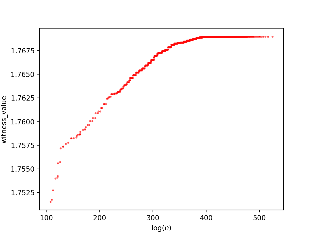
The cumulative maximum witness value for the large database.
And for the small database
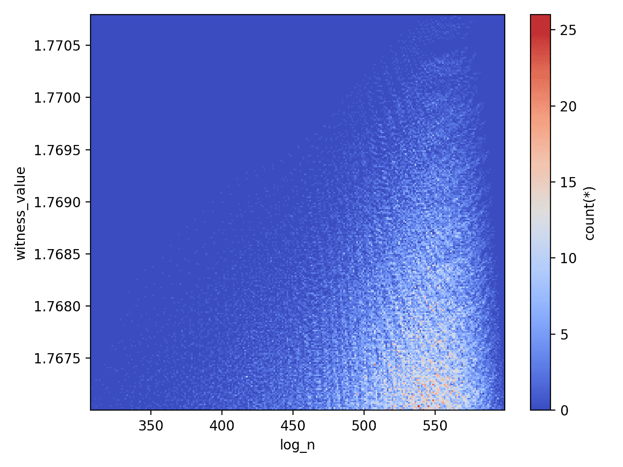
A heatmap for the witness values for the small database
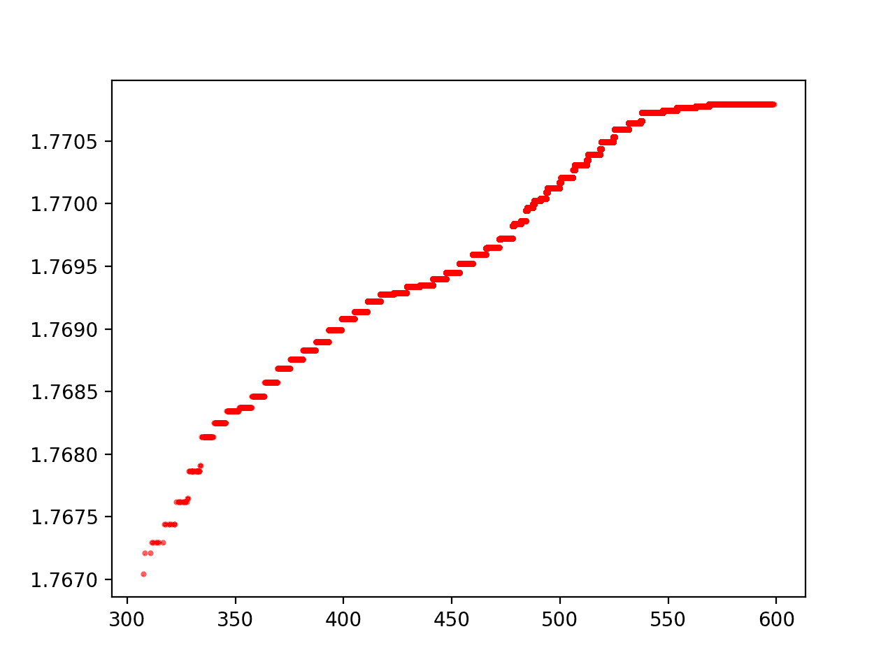
The cumulative maximum witness value for the small database.
Note, the two ridges disagree slightly (the large database shows a longer flat line than the small database for the same range), because of the way that the superabundant enumeration doesn’t go in increasing order of $ n$. So larger witness values in the range 400-500 are found later.
Estimating the max witness value growth rate
The next obvious question is whether we can fit the curves above to provide an estimate of how far we might have to look to find the first witness value that exceeds the desired 1.782 threshold. Of course, this will obviously depend on the appropriateness of the underlying model.
A simple first guess would be split between two options: the real data is asymptotic like $ a + b / x$ approaching some number less than 1.782 (and hence this approach cannot disprove RH), or the real data grows slowly (perhaps doubly-logarithmic) like $ a + b \log \log x$, but eventually surpasses 1.782 (and RH is false). For both cases, we can use scipy’s curve fitting routine as in this pull request.
For the large database (roughly using log n < 400 since that’s when the curve flatlines due to the enumeration order), we get a reciprocal fit of
$$\displaystyle f(x) \approx 1.77579122 – 2.72527824 / x$$and a logarithmic fit of
$$\displaystyle f(x) \approx 1.65074314 + 0.06642373 \log(\log(x))$$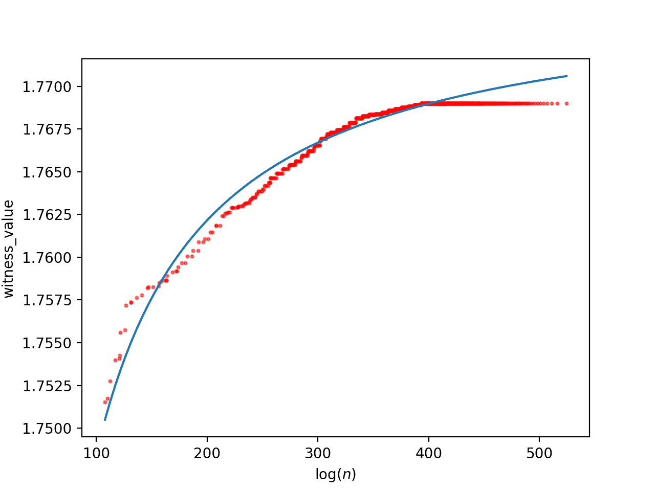
The fit of the large database to a + b/x. Note the asymptote of 1.7757 suggests this will not disprove RH.
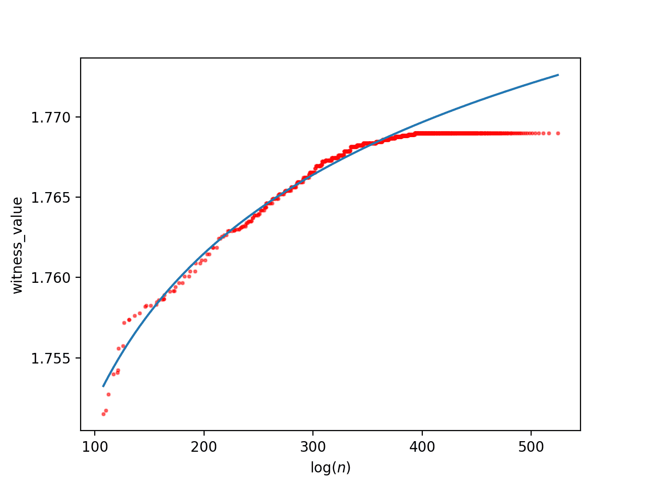
The fit of the large database to a + b log log x. If this is accurate, we would find the counterexample around log(n) = 1359.
The estimated asymptote is around 1.7757 in the first case, and the second case estimates we’d find an RH counterexample at around $ log(n) = 1359$.
For the small database of only sufficiently large witness values, this time going up to about $ log(n) \approx 575$, the asymptotic approximation is
$$\displaystyle 1.77481154 -2.31226382 / x$$And the logarithmic approximation is
$$\displaystyle 1.70825262 + 0.03390312 \log(\log(x))$$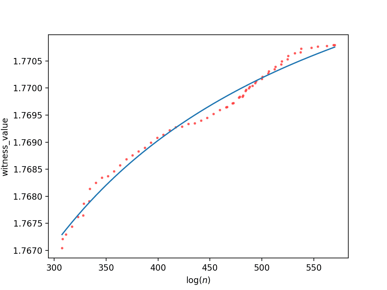
The reciprocal approximation of the small database with asymptote 1.77481154
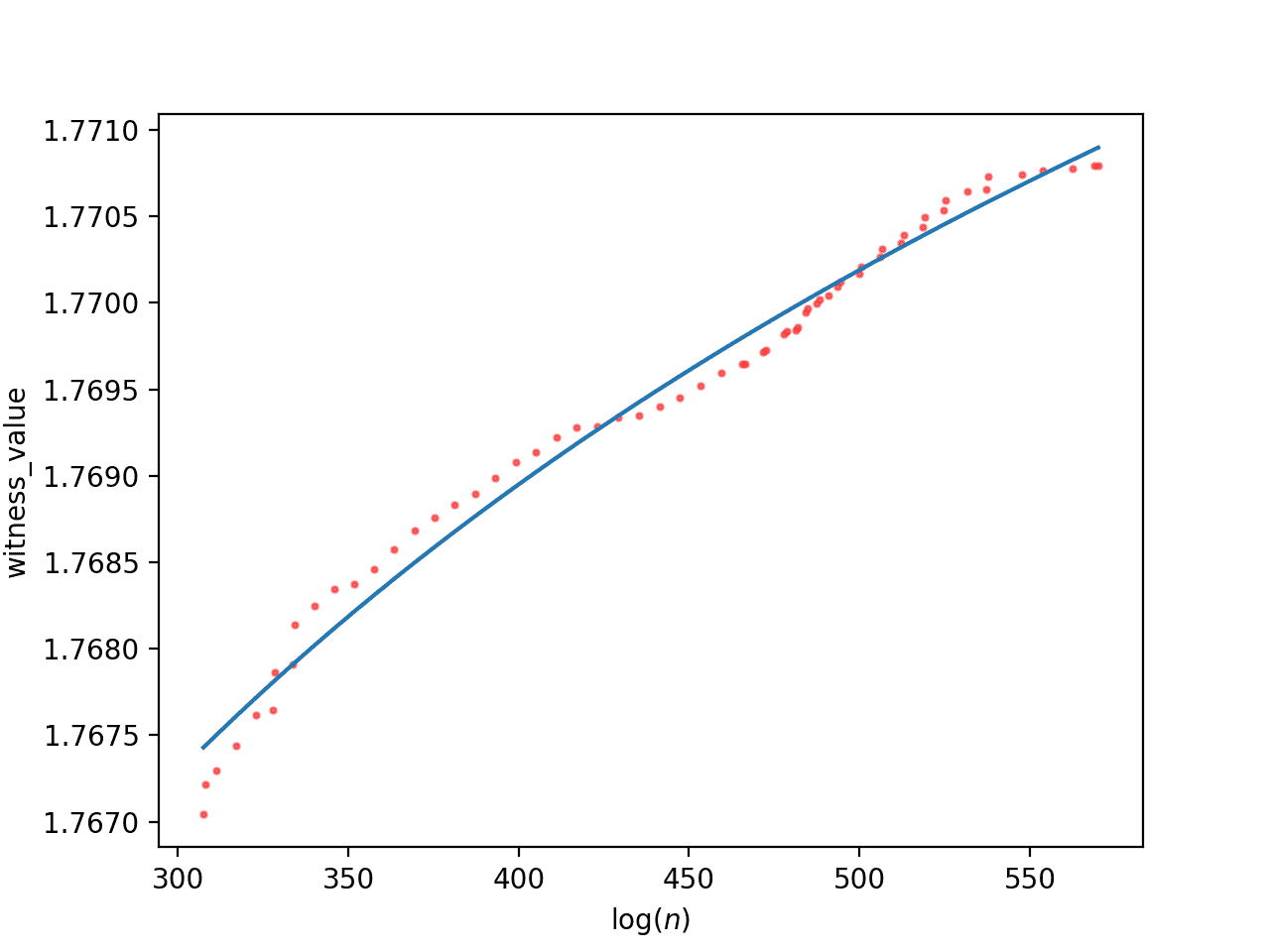
The logarithmic approximation of the small database with RH counterexample estimate at log(n) = 6663
Now the asymptote is slightly lower, at 1.7748, and the logarithmic model approximates the counterexample can be found at approximately $ \log(n) = 6663$.
Both of the logarithmic approximations suggest that if we want to find an RH counterexample, we would need to look at numbers with thousands of prime factors. The first estimate puts a counterexample at about $ 2^{1960}$, the second at $ 2^{9612}$, so let’s say between 1k and 10k prime factors.
Luckily, we can actually jump forward in the superabundant enumeration to exactly the set of candidates with $ m$ prime factors. So it might make sense to jump ahead to, say, 5k prime factors and search in that region. However, the size of a level set of the superabundant enumeration still grows exponentially in $ m$. Perhaps we should (heuristically) narrow down the search space by looking for patterns in the distribution of prime factors for the best witness values we’ve found thus far. Perhaps the values of $ n$ with the best witness values tend to have a certain concentration of prime factors.
Exploring prime factorizations
At first, my thought was to take the largest witness values, look at their prime factorizations, and try to see a pattern when compared to smaller witness values. However, other than the obvious fact that the larger witness values correspond to larger numbers (more and larger prime factors), I didn’t see an obvious pattern from squinting at plots.
To go in a completely different direction, I wanted to try out the UMAP software package, a very nice and mathematically sophisticated for high dimensional data visualization. It’s properly termed a dimensionality reduction technique, meaning it takes as input a high-dimensional set of data, and produces as output a low-dimensional embedding of that data that tries to maintain the same shape as the input, where “shape” is in the sense of a certain Riemannian metric inferred from the high dimensional data. If there is structure among the prime factorizations, then UMAP should plot a pretty picture, and perhaps that will suggest some clearer approach.
To apply this to the RH witness value dataset, we can take each pair $ (n, \sigma(n)/(n \log \log n))$, and associate that with a new (high dimensional) data point corresponding to the witness value paired with the number’s prime factorization
$ \displaystyle (\sigma(n)/(n \log \log n), k_1, k_2, \dots, k_d)$,
where $ n = 2^{k_1} 3^{k_2} 5^{k_3} \dots p_d^{k_d}$, with zero-exponents included so that all points have the same dimension. This pull request adds the ability to factorize and export the witness values to a CSV file as specified, and this pull request adds the CSV data (using git-lfs), along with the script to run UMAP, the resulting plots shown below, and the saved embeddings as .npy files (numpy arrays).
When we do nothing special to the data and run it through UMAP we see this plot.
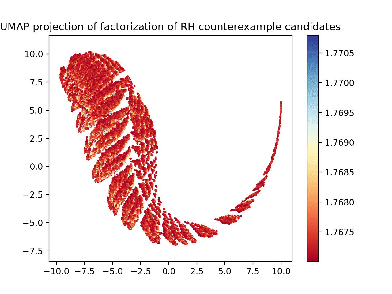
UMAP plotted on the raw prime factorization and witness value dataset.
It looks cool, but if you stare at it for long enough (and if you zoom in when you generate the plot yourself in matplotlib) you can convince yourself that it’s not finding much useful structure. The red dots dominate (lower witness values) and the blue dots are kind of spread haphazardly throughout the red regions. The “ridges” along the chart are probably due to how the superabundant enumeration skips lots of numbers, and that’s why it thins out on one end: the thinning out corresponds to fewer numbers processed that are that large since the enumeration is not uniform.
It also seemed like there is too much data. The plot above has some 80k points on it. After filtering down to just those points whose witness values are bigger than 1.769, we get a more manageable plot.
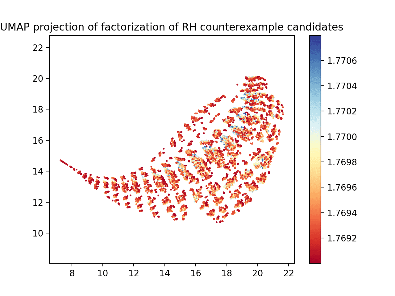
Witness values and prime factors processed with UMAP, where the witness value is at least 1.769.
This is a bit more reasonable. You can see a stripe of blue dots going through the middle of the plot.
Before figuring out how that blue ridge might relate to the prime factor patterns, let’s take this a few steps further. Typically in machine learning contexts, it helps to normalize your data, i.e., to transform each input dimension into a standard Z-score with respect to the set of values seen in that dimension, subtracting the mean and dividing by the standard deviation. Since the witness values are so close to each other, they’re a good candidate for such normalization. Here’s what UMAP plots when we normalize the witness value column only.
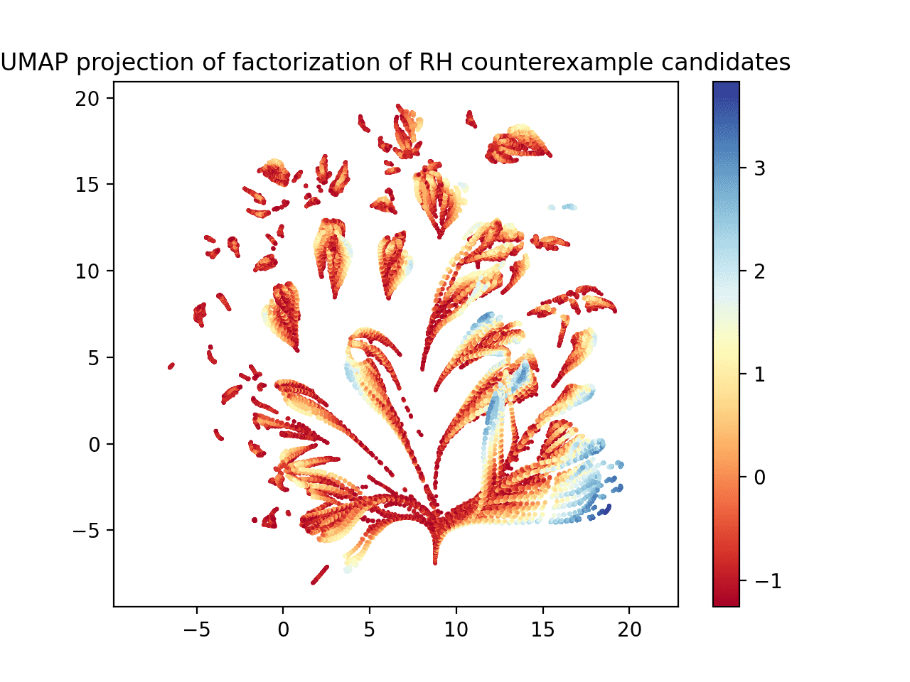
UMAP applied to the (normalized) witness values and prime factorizations. Applied to all witness values.
Now this is a bit more interesting! Here the colormap on the right is in units of standard deviation of witness values. You can see a definite bluest region, and it appears that the data is organized into long brushstrokes, where the witness values increase as you move from one end of the stroke to the other. At worst, this suggests that the dataset has structure that a learning algorithm could discover.
Going even one step further, what if we normalize all the columns? Well, it’s not as interesting.
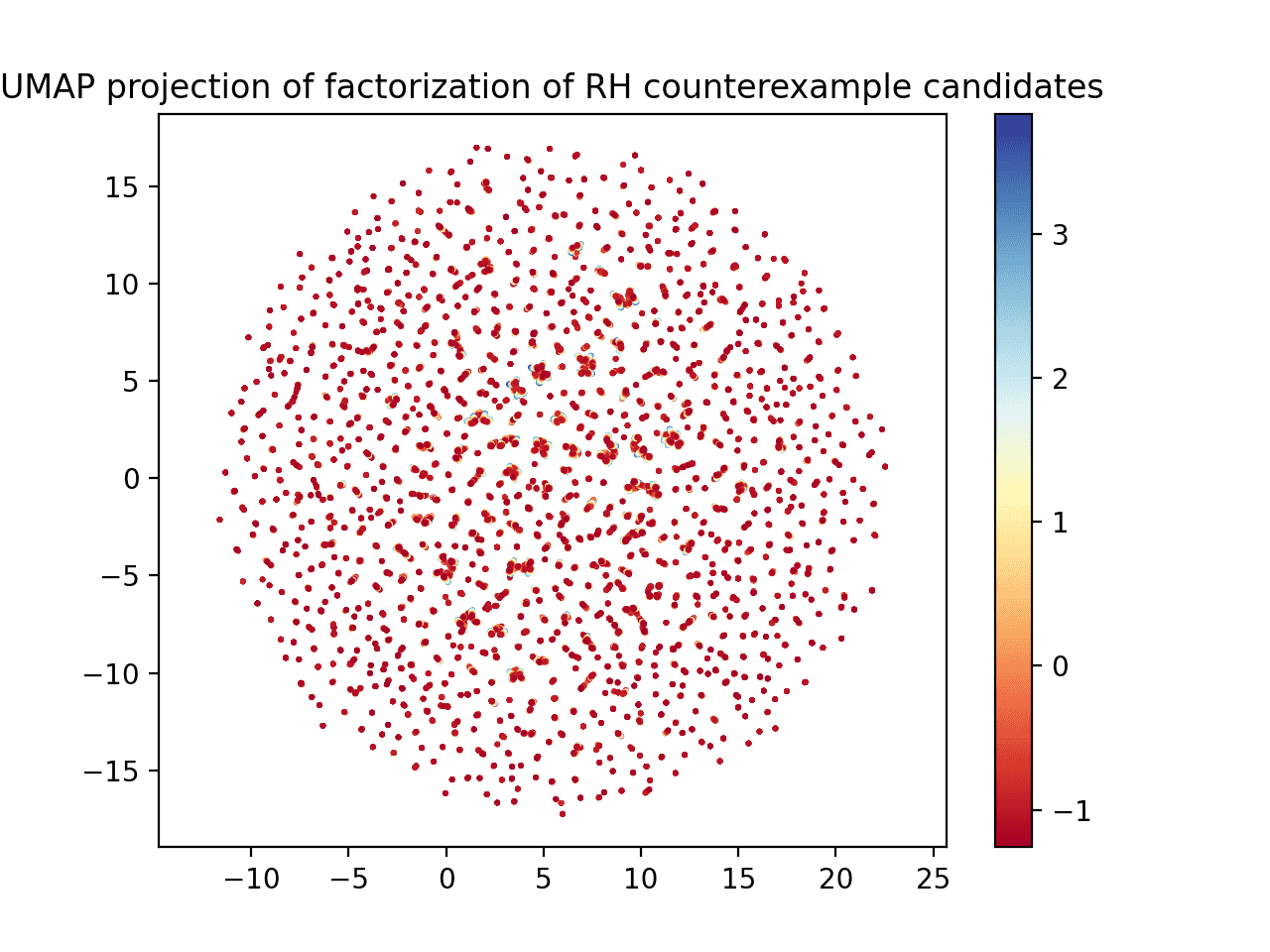
UMAP when normalizing all columns, not just the witness value.
If you zoom in, you can see that the same sort of “brushstroke” idea is occurring here too, with blue on one end and red on the other. It’s just harder to see.
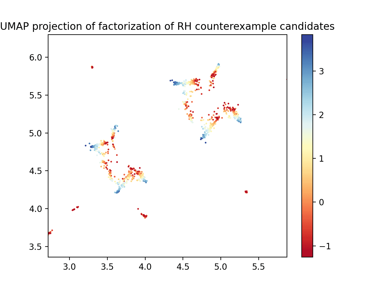
The previous image, zoomed in around a cluster of data
We would like to study the prettiest picture and see if we can determine what pattern of prime numbers the blue region has, if any. The embedding files are stored on github.
I’ve been sitting on this draft for a while, and while this article didn’t make a ton of headway, the pictures will have to do while I’m still dealing with my new home purchase.
Some ideas for next steps:
- Squint harder at the distributions of primes for the largest witness values in comparison to the rest.
- See if a machine learning algorithm can regress witness values based on their prime factorizations (and any other useful features I can derive). Study the resulting hypothesis to determine which features are the most important. Use that to refine the search strategy.
- Try searching randomly in the superabundant enumeration around 1k and 10k prime factors, and see if the best witness values found there match the log-log regression.
- Since witness values above a given threshold seem to be quite common, and because the UMAP visualization shows some possible “locality” structure for larger witness values, it suggests if there is a counterexample to RH then there are probably many. So a local search method (e.g., local neighborhood search/discrete gradient ascent with random restarts) might allow us to get a better sense for whether we are on the right track.
Until next time!
Want to respond? Send me an email, post a webmention, or find me elsewhere on the internet.